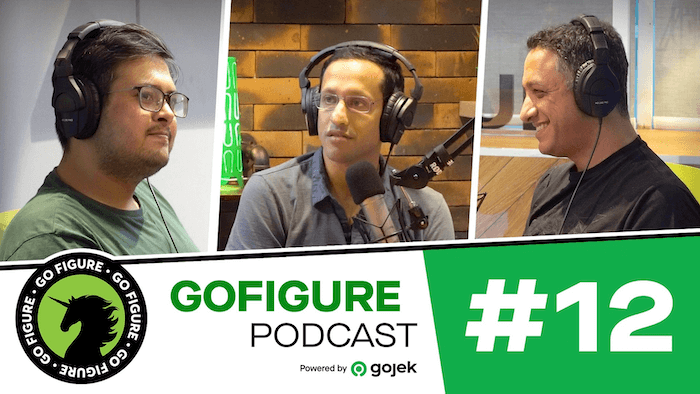
I was on as Head of Product for GoFood, not as a designer, and Nadiem's actual question to me was whether I agreed with Abhinit's definition of design. I did, mostly, but the place I kept pushing the conversation was this: once you're responsible for the product's outcome, not just its pixels, the word "design" has to mean something bigger than what's on the screen. Everything below is really one argument, made four different ways, about where that line actually sits.
Owning the outcome, not just the interface, is what changes what design has to mean.
Design is user experience, and that starts with the medium
The narrowest version of the argument first, because it's the one closest to what most people mean by "design." I agreed with Abhinit's framing to quite an extent, but when we say design, what we specifically mean is user experience design, and a good user experience starts with someone who understands the medium very well. If you're making apps, you need to know what iOS can do and what Android can do. If you're making websites, you need to know what browsers can and can't do.
If a software designer doesn't understand the medium, the closer you get to the machine, the more that ignorance shows up as bad solutions.
You don't need to be the engineer. You do need to understand the constraints well enough that what you're proposing is actually real. But knowing the medium is table stakes, not the whole job, and the rest of the conversation was about what sits on top of it.
Great design assumes the user is incredibly lazy
On top of that came the hypothesis I actually put on the table for anything UX-related at GoFood.
Great design assumes the user is incredibly lazy, and may not want to use your service if they don't have to.
If someone has to spend real effort figuring out your product, you've already lost, especially in apps, where the assumption has to be that no one wants to spend any time on this until it takes the least amount of time. The honest version of this, as I remember arguing it internally, wasn't about the ordering screen at all. It was about restaurant onboarding: we kept polishing the app's checkout flow while the actual drop-off was happening in the paperwork and setup steps before a restaurant ever went live, a part of the funnel with no screen in it whatsoever. Treating the merchant as "lazy" too, not just the end customer, was the uncomfortable extension of the hypothesis, and it's the one that took longer for the team to accept.
The real experience is bigger than the app, and the drill bit is why
That onboarding gap is really the same failure as the old saying I brought into the podcast to make the point concrete: the user doesn't want a nine-inch drill bit, they want a nine-inch hole. A restaurant owner doesn't want an onboarding flow, they want to be selling food on the platform, and everything between agreeing to join and actually going live, sales visits, paperwork, menu setup, none of it running through any software, is still part of what they experience. I've written elsewhere about the restaurant who went from $300 a month selling pisang goreng on the street to over $100,000 a month once she was actually live and selling in volume on GoFood; the gap between "agreed to join" and "actually live and earning like that" was where most of the real design problem sat, and almost none of it was a screen.
The biggest problem with our products is always outside of the software. I can make sure our app shines, but if you can't find a driver, it's a waste of the user's time.
If the ride is bad, or the food shows up cold, none of that is a screen problem, but all of it is a design problem. Interior design that ignores how a family actually eats dinner together is what the industry calls lipstick on a pig: it looks resolved and isn't. The best designers design the totality of the experience, drill bit and hole both, not just the part that happens to run through a smartphone.
Service design isn't new, software just makes people forget that
Zoom out far enough and none of this is actually new. Service design didn't start with apps. It goes back to people trying to improve how customers experienced a physical service, banks working out how long people wait in a lounge, or automobile service centers designing how customers arrive, how long the wait is, and how you tell someone their car is ready. Software didn't invent the discipline of designing an entire experience end to end, it just gave people a new medium to forget that the rest of the experience still counts, the same thing GoFood's own onboarding numbers were quietly proving the whole time.
What I actually took away from arguing this live, on a recording, in front of people who'd immediately go check my claims against their own experience of the product, is that I believed the "lazy user" hypothesis a lot more casually before I had to defend it out loud. Saying it on a podcast is what made me go back and actually test whether GoFood's onboarding funnel lived up to it. It didn't, not fully, and that gap is still the more useful memory from that recording than anything I actually said into the microphone.
Cross posted from the GoFigure blog